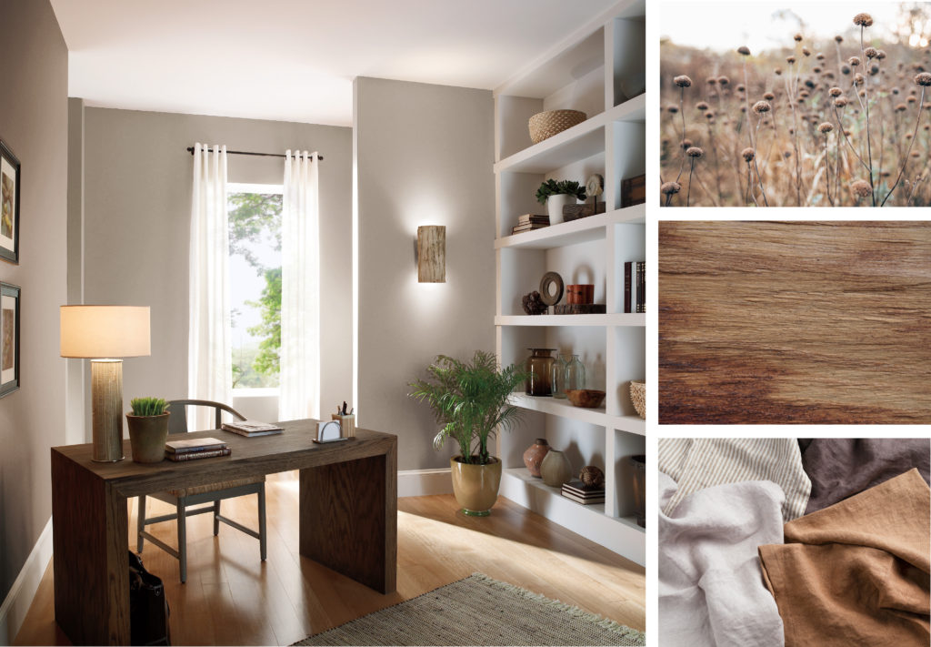
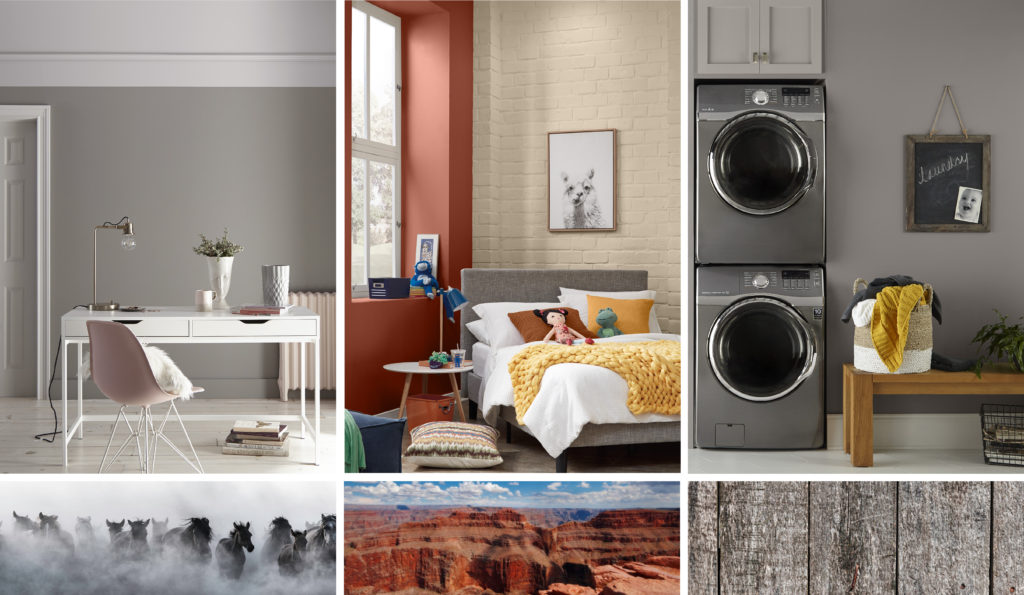
Office – wall: Studio Taupe PPU5-07
Once I heard neutrals described as “People, countries and colours that mind their own business.” It’s a true statement. Neutrals hold their ground and do not waver. To me neutral colours are masters of subtlety, stable as time, aligned with nature and easy to use. I’ve never met a neutral I didn’t like.
So, what defines a neutral colour as it relates to home décor?
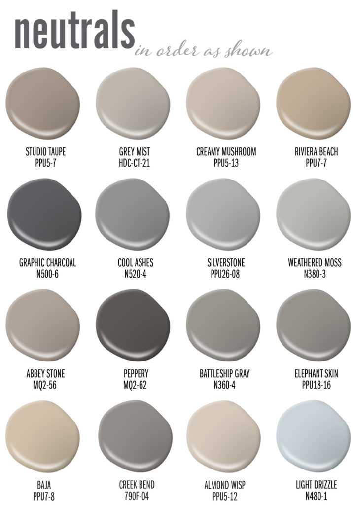
Neutrals come from the natural world. They range in a variety of white, grey, black, brown, beige, and taupe hues. Words like earth-tone, stony, smoky, foggy, misted, shaded, or wood-toned are often applied to such colours. It often looks like a bit of dust has settled over them, or they’ve weathered storms that have washed vivid colour intensity away.
Living Room – wall: Grey Mist HDC-CT-21
Divided into two camps, neutrals can be considered either warm (brown families) or cool (grey families). Everything that falls between are wonderful nuances: driftwood, mushroom, taupe, mist, charcoal, fawn, tan, and sand.
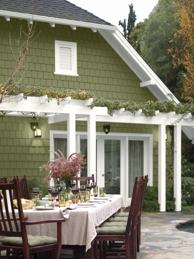
Dining Room – upper wall: Creamy Mushroom PPU5-13, lower wall: Riviera Beach PPU7-07
Living Room – fireplace wall: Graphic Charcoal N500-6, back wall: Cool Ashes N520-4
Neutrals are known to have complex compositions, meaning they often hold an undercurrent of another colour. For example, a grey married to blue becomes a cool stone grey. Grey carrying a hint of green becomes lichen. A dark brown might be tinged with red to create a rich mahogany tone.
Nursey – wall: Silverstone PPU26-08
Living Room – wall: Weathered Moss N380-3
Library – wall: Abbey Stone MQ2-56, cabinets: Peppery MQ2-62
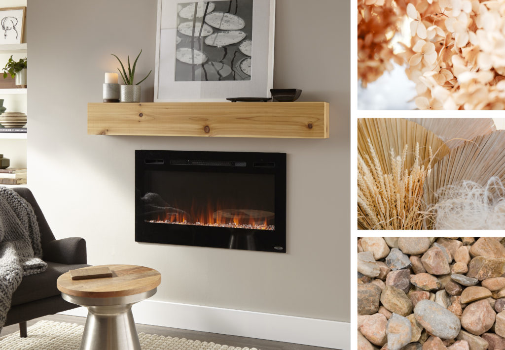
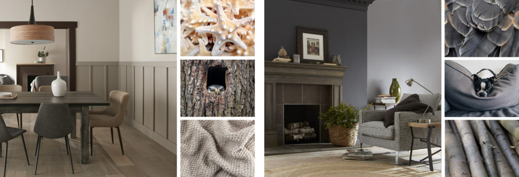
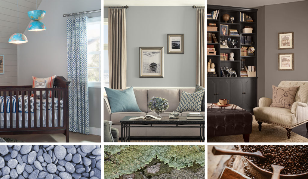
Their quiet, unassuming nature makes neutrals perfect for all four walls, and they can be successfully used in any room. They make easy background colours because they don’t fight for attention with furniture, artwork, cabinetry or other materials that may be brighter in colour.
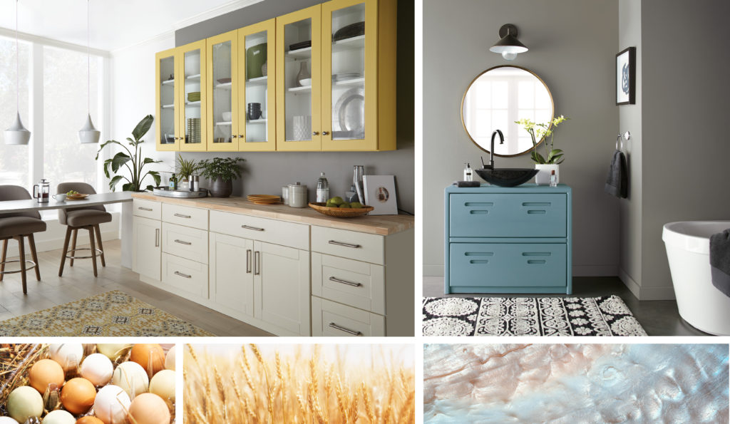
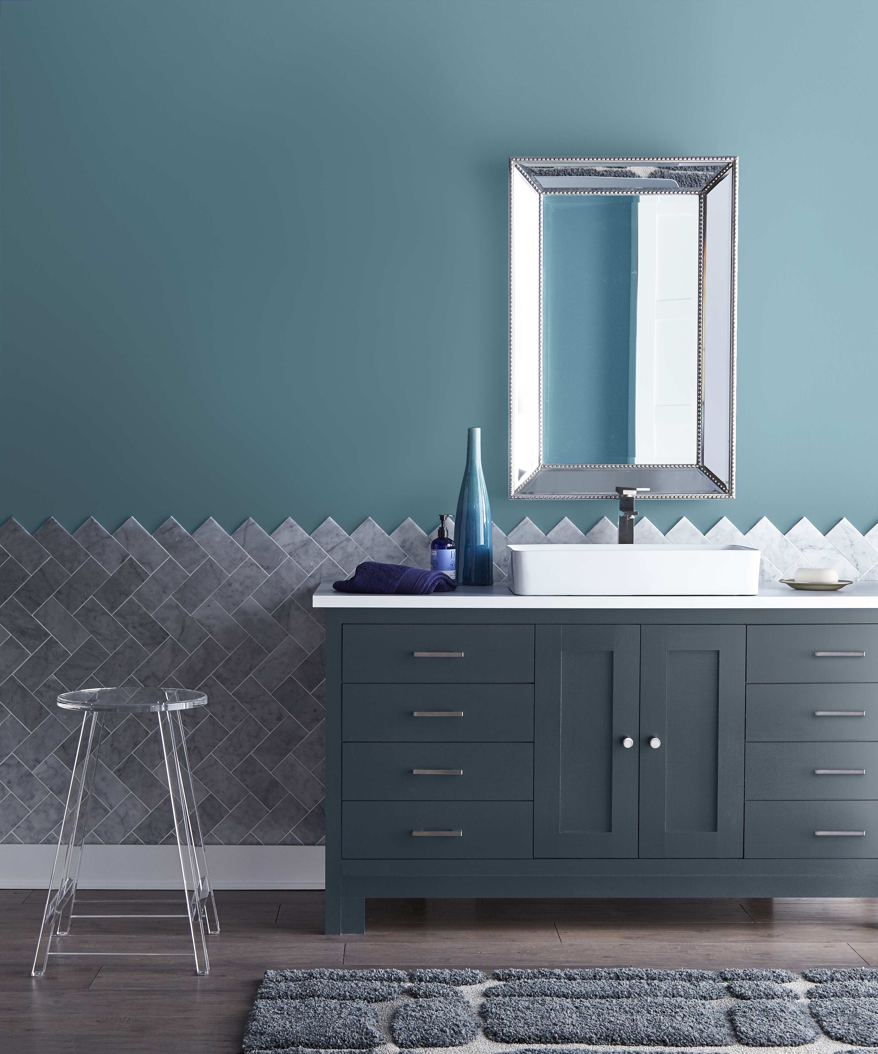
Kitchen & Bathroom – walls: Battleship Gray N360-4
Favoured for their versatility, neutrals pair well with almost any other colour. Grey or tan walls live perfectly well with white trim around windows, doorways and baseboards. They harmonize with bright, bold colours used for accents, window treatments and upholstery. Tone on tone neutrals sets the mood for serene and tranquil places of relaxation. Make a statement with dark and dramatic colours like charcoal, black or chocolate brown.
Office – wall: Elephant Skin PPU18-16
Bedroom – brick wall: Baja PPU7-08
Laundry – wall: Creek Bend 790F-4, cabinets: Grey Mist HDC-CT-21
Neutrals are ideal for large open spaces and for connecting one room to another. Use neutrals in traffic areas like hallways, stairway landings to move from public to private areas of the home. They also help transition people from outdoor surroundings to indoor settings.

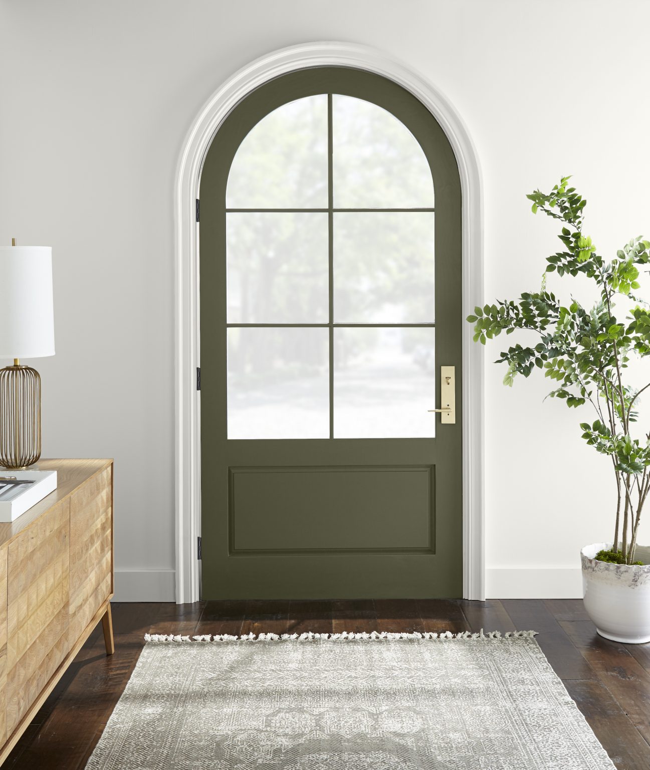
Hallway & Entry – walls: Almond Wisp PPU5-12, back wall & door: Light Drizzle N480-1
Neutral colours can enhance your home in many positive ways. To find out more about these colours and more visit behr.ca or the Grey and Neutral colour sections in the Colour Solution Center at The Home Depot.
Colourfully Yours,
Erika