The kitchen is more than a place to cook. It is where mornings begin, conversations unfold and everyday moments feel a little more memorable. Colour can help set that tone, whether you want a kitchen that feels bright and airy, cozy and grounded, bold and expressive, or timeless and refined. From whites and neutrals to every hue of the colour wheel, here are inspiring ways to bring colour into the heart of the home.
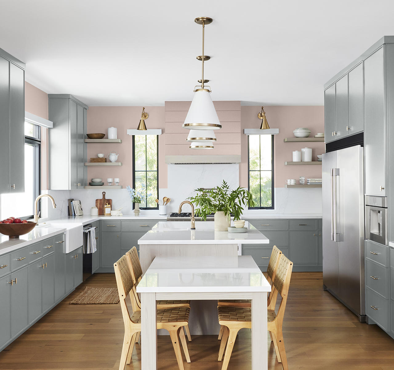
Pinks: Warm, Playful and Fresh Muted blush, dusty rose and warm peach-pink tones create a welcoming atmosphere. These softer shades pair beautifully with creamy whites, greys, warm woods, brass accents and light tone tiles.
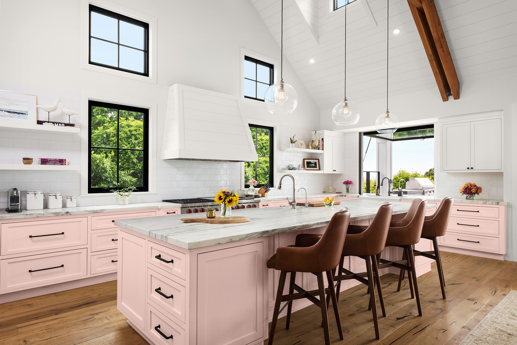
For a subtle look, use a pink paint colour on walls; for more impact, consider them on the cabinet or as an accent feature.
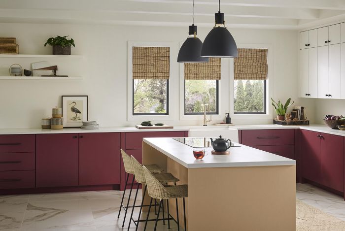
Reds: Rich, Confident and Inviting Deep crimson, clay red or muted berry tones can make a beautiful statement on cabinets, an island, pantry door or accent wall. Pair them with warm whites, neutrals and natural wood and dark or aged metal finishes for a look that feels layered and inviting.
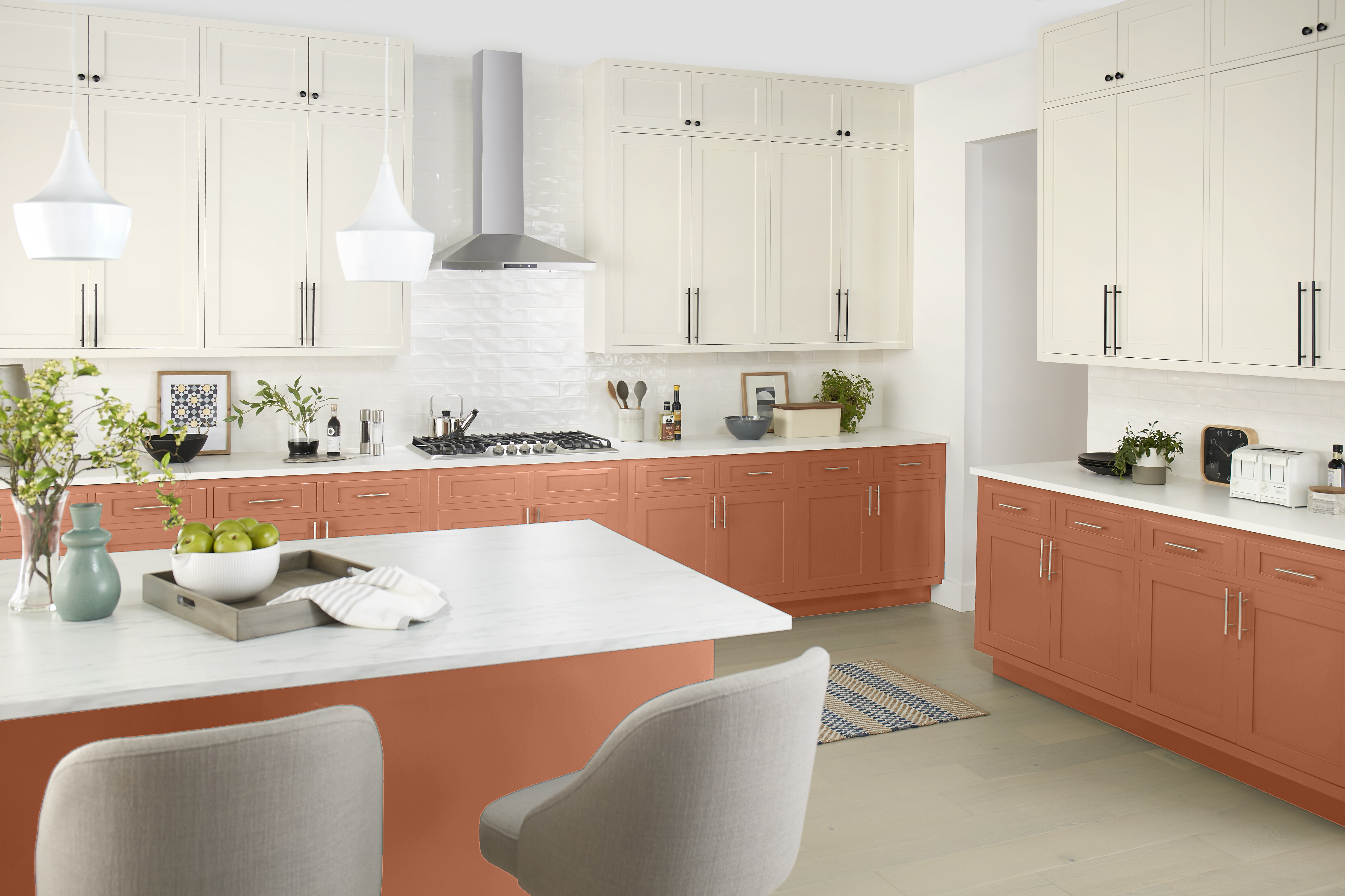
Oranges: Earthy, Energetic and Welcoming Terracotta, rust and soft apricot hues add a sunbaked warmth that feels relaxed and welcoming. These tones feel especially fresh alongside creamy whites, warm neutrals and natural materials like wood, stone and ceramic. Consider using them in breakfast nooks, open shelving backdrops or accent areas for a cheerful, lived-in feel.
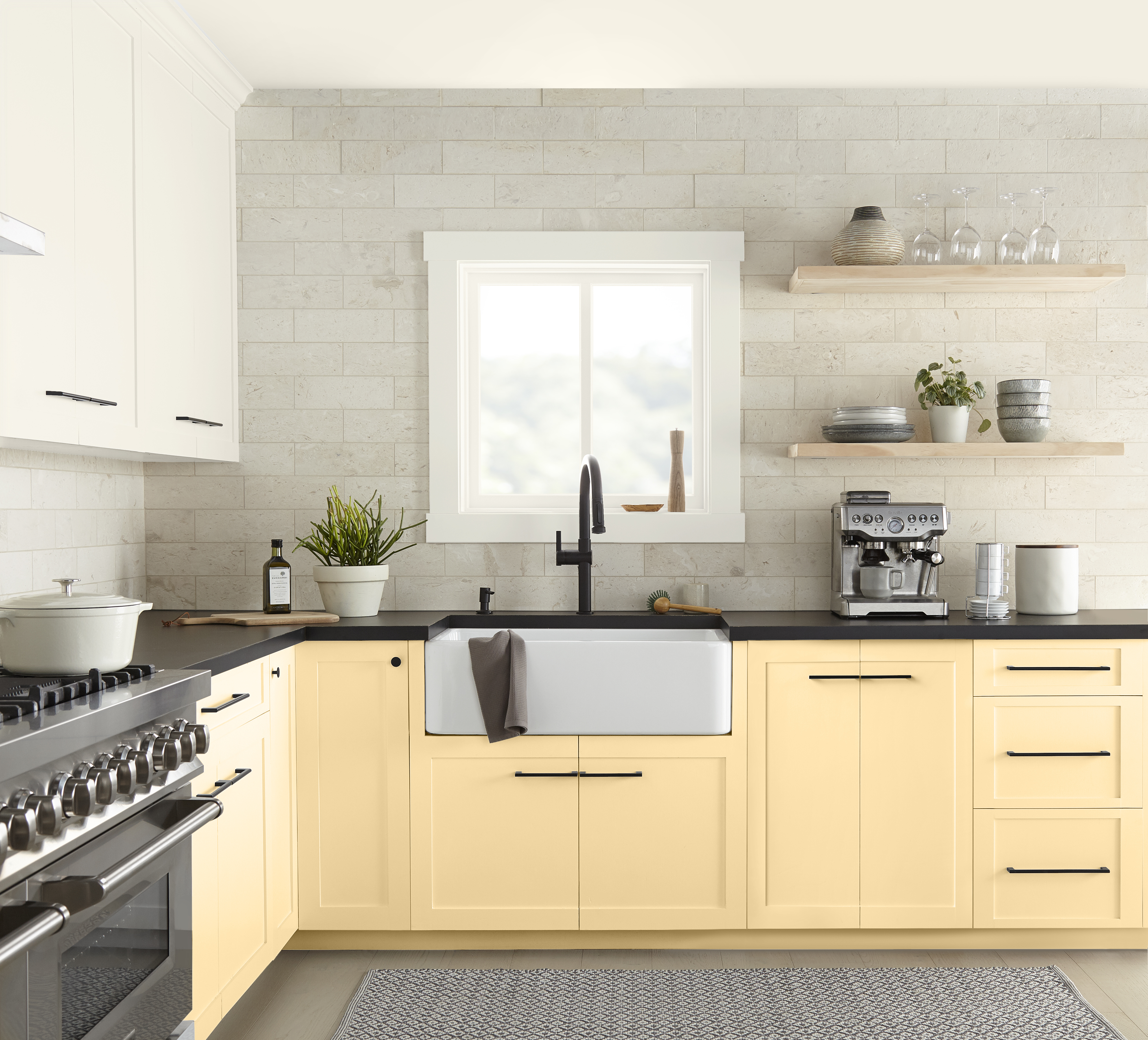
Yellows: Cheerful, Sunny and Uplifting Soft buttery tones create a cozy, cottage-inspired mood, while richer golden hues bring more energy to the space. These sunny shades make great small kitchen paint colours and work beautifully in kitchens that need a boost of warmth, especially when paired with white cabinetry, natural wood, or soft neutral accents.
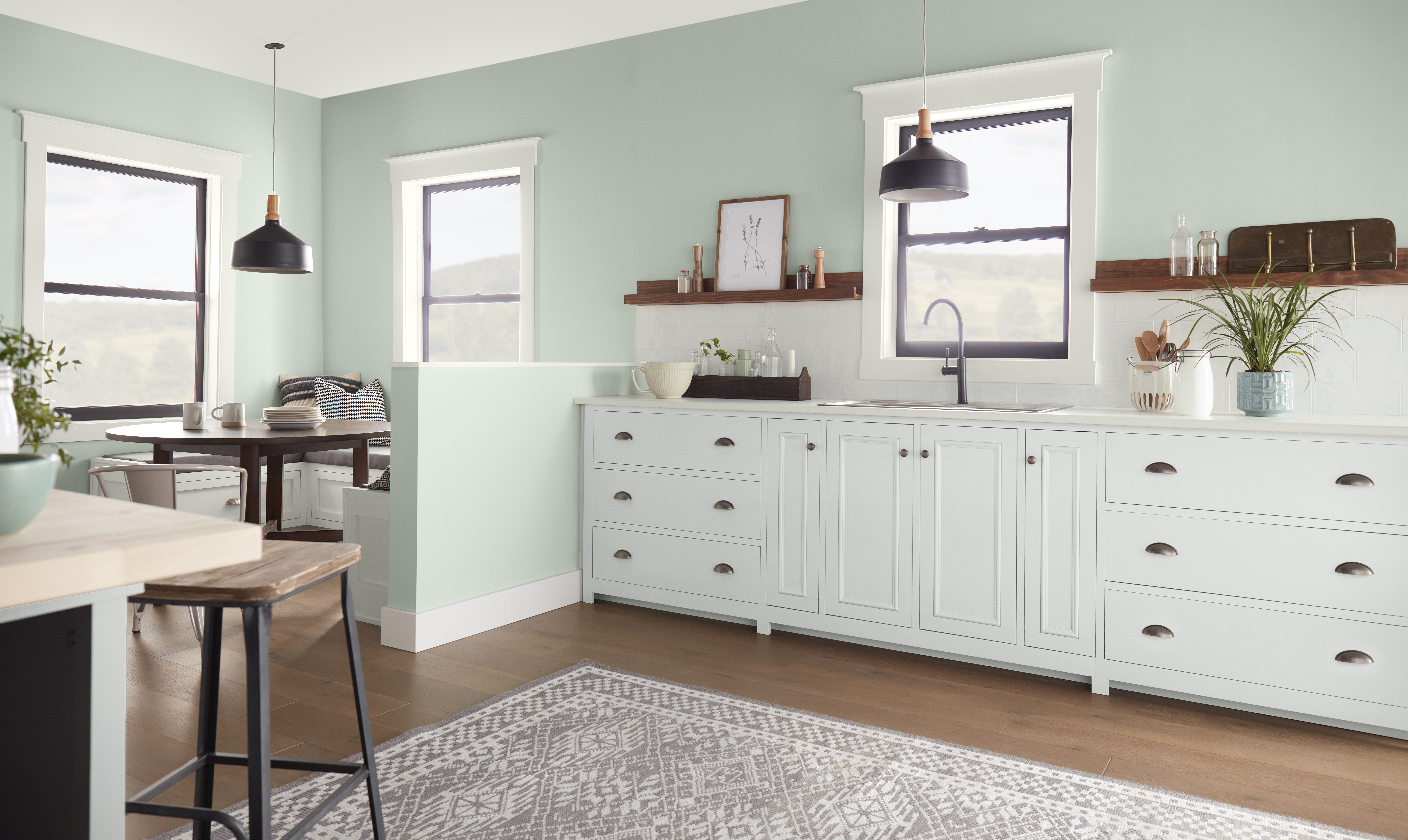
Greens: Fresh, Restorative and Natural Green is a natural fit for the kitchen because it pairs beautifully with herbs, produce, and organic materials. Soft sage greens create a calm, relaxed atmosphere and complement white cabinetry, natural wood tones, and a variety of metal finishes. These nature-inspired hues bring a sense of freshness and balance to the space, making the kitchen feel both inviting and serene.
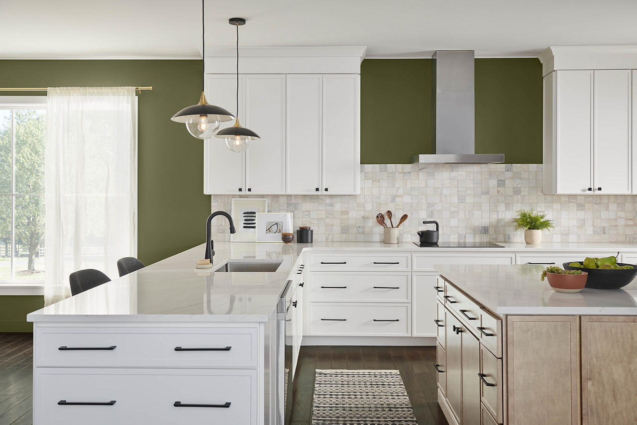
Use green on cabinets for a nature-inspired statement, or on walls for a refreshing backdrop that still feels easy to live with. Deeper olive or forest greens add richness, earthy sophistication, depth, and character to kitchens. Whether used on cabinets, walls, or an island, green is a versatile kitchen paint colour that connects the space to nature while creating a timeless, welcoming feel.
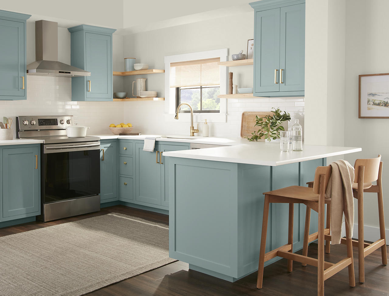
Blues: Calm, Crisp and Timeless Pale tones create an airy, coastal-inspired atmosphere, while navy and deeper shades add classic contrast and drama. These cooler hues pair beautifully with white tile, marble-look surfaces, warm wood and brushed metal finishes.
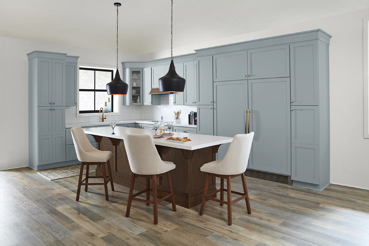
For a kitchen colour palette, lighter blues can help brighten walls, while deeper blue paint colours work well on islands, lower cabinets or pantry doors.
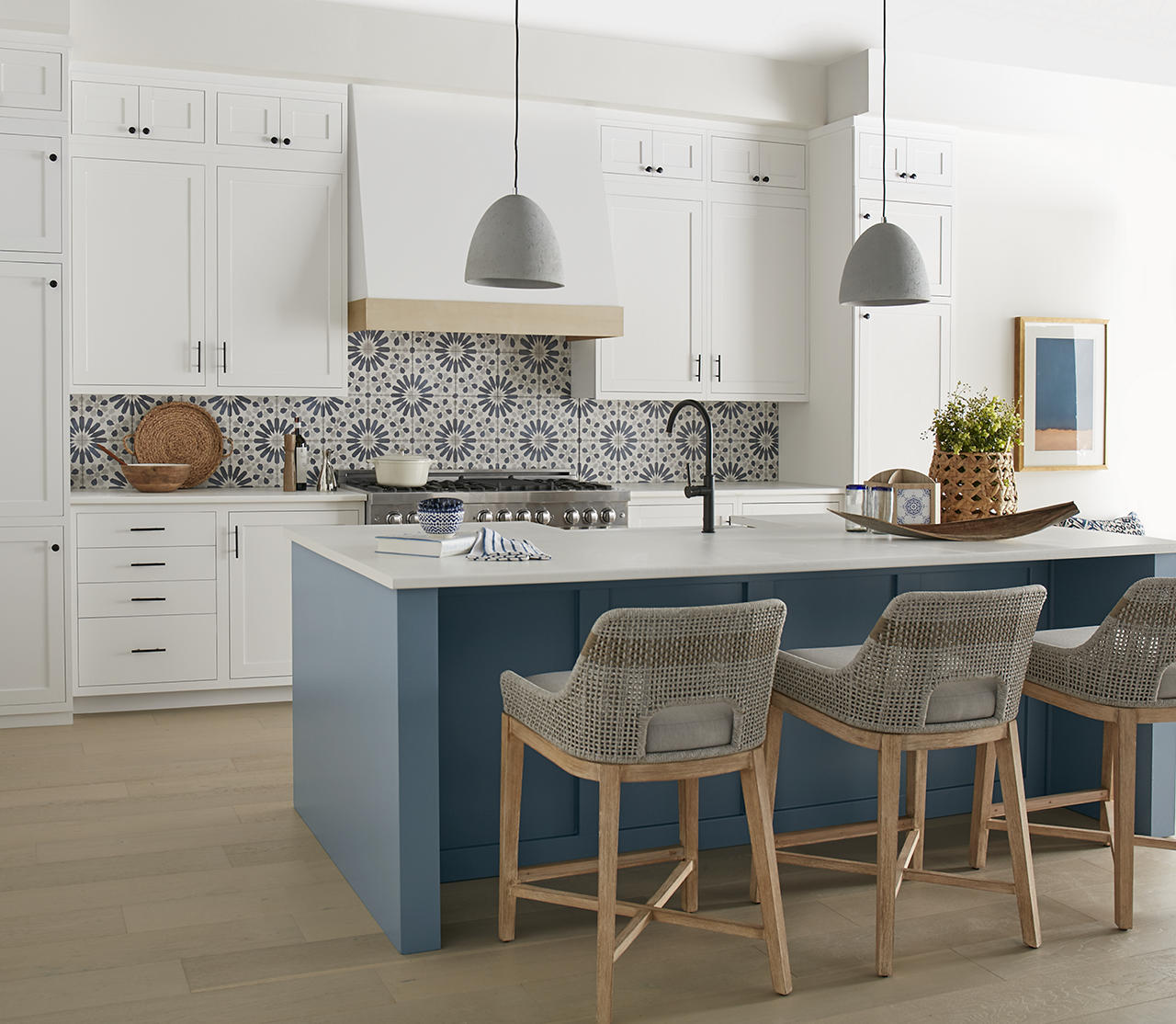
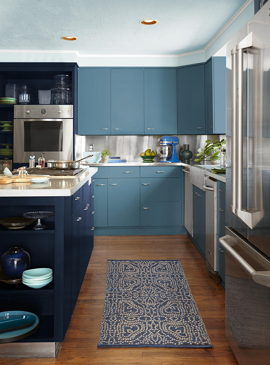
Colour drench a kitchen with shades of blue using a simple kitchen colour scheme that layers two to three blue paint colours from the same colour family. Apply them across cabinets, walls, trim, and accent areas to create depth and dimension. For a refined focal point, use blue on an island or throughout the cabinetry for a cohesive, timeless statement.
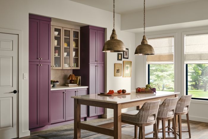
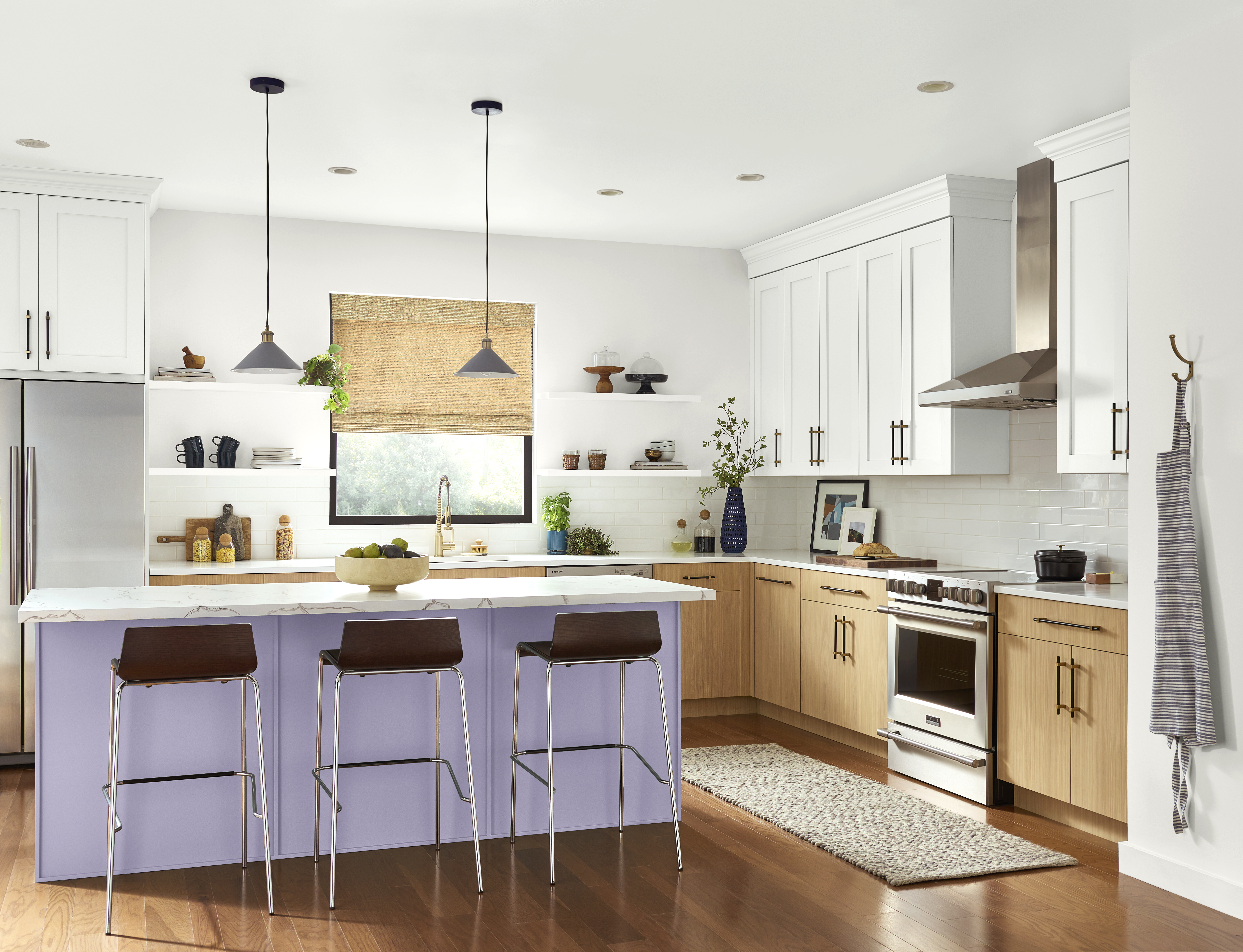
Purples: Soft, Creative and Unexpected Lavender, mauve and plum-inspired shades can bring personality and creativity into the kitchen. Softer tones feel gentle and modern, while darker shades create a rich, dramatic effect. Use these colours in smaller doses, such as an island, pantry door, breakfast nook or accent cabinetry, for a look that feels personal without overwhelming the space.
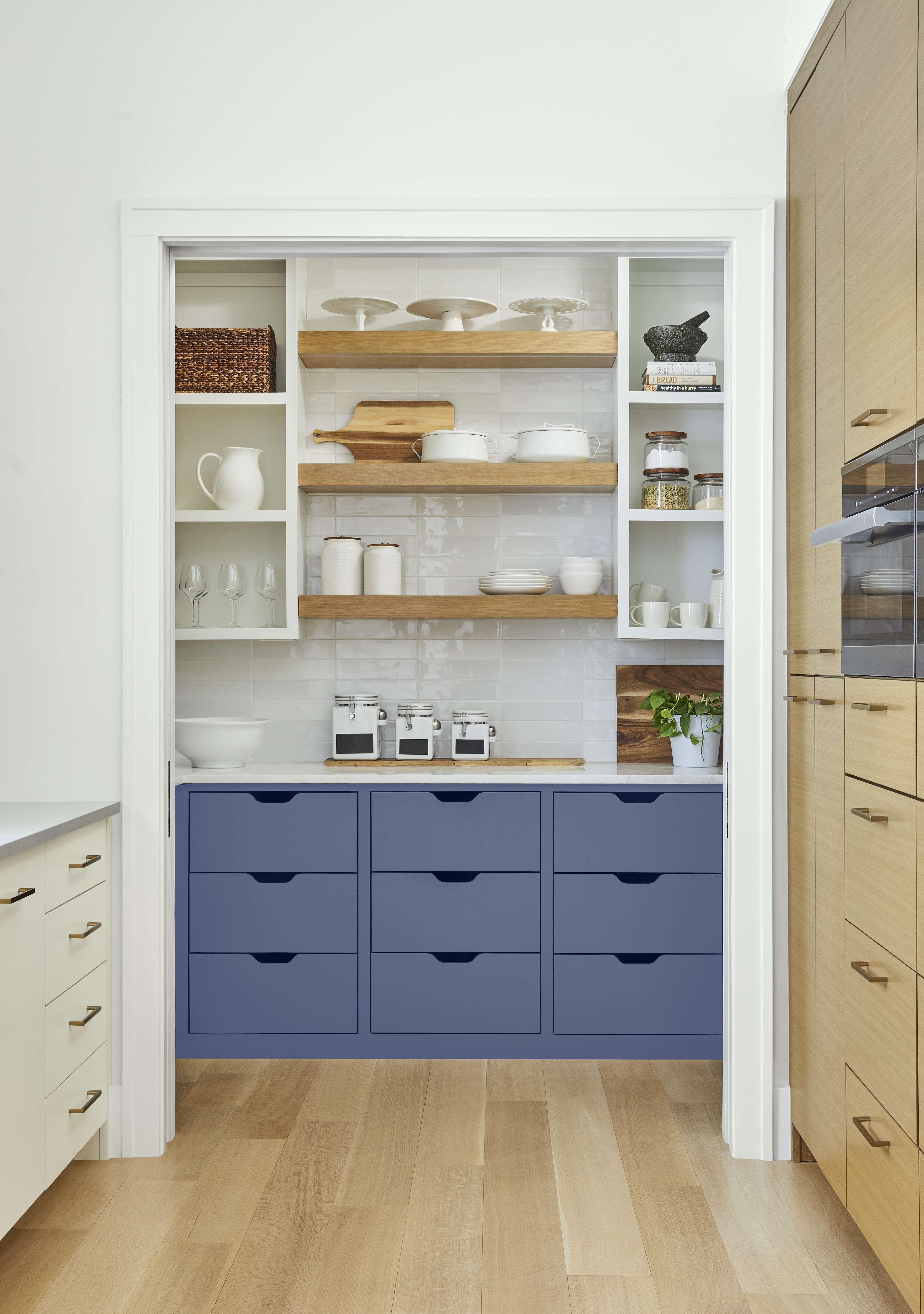
Whites: Clean, Bright and Classic A soft white can make cabinetry feel crisp, walls feel brighter and natural light feel more expansive. For a warmer look, choose creamy whites that pair beautifully with wood tones, woven textures and brass or bronze accents. For a more modern feel, try a cleaner white with black hardware, stone countertops or sleek stainless steel.
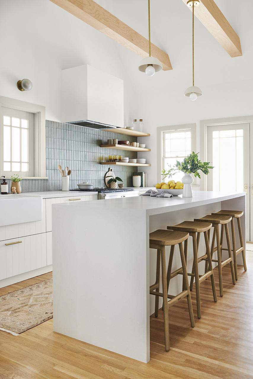
Neutrals: Warm, Grounded and Versatile Comforting beige, taupe, greige and soft brown tones create a welcoming backdrop that feels timeless without feeling plain. These shades work especially well on walls, islands or lower cabinets, where they can ground the space while allowing tile, countertops and décor to shine.
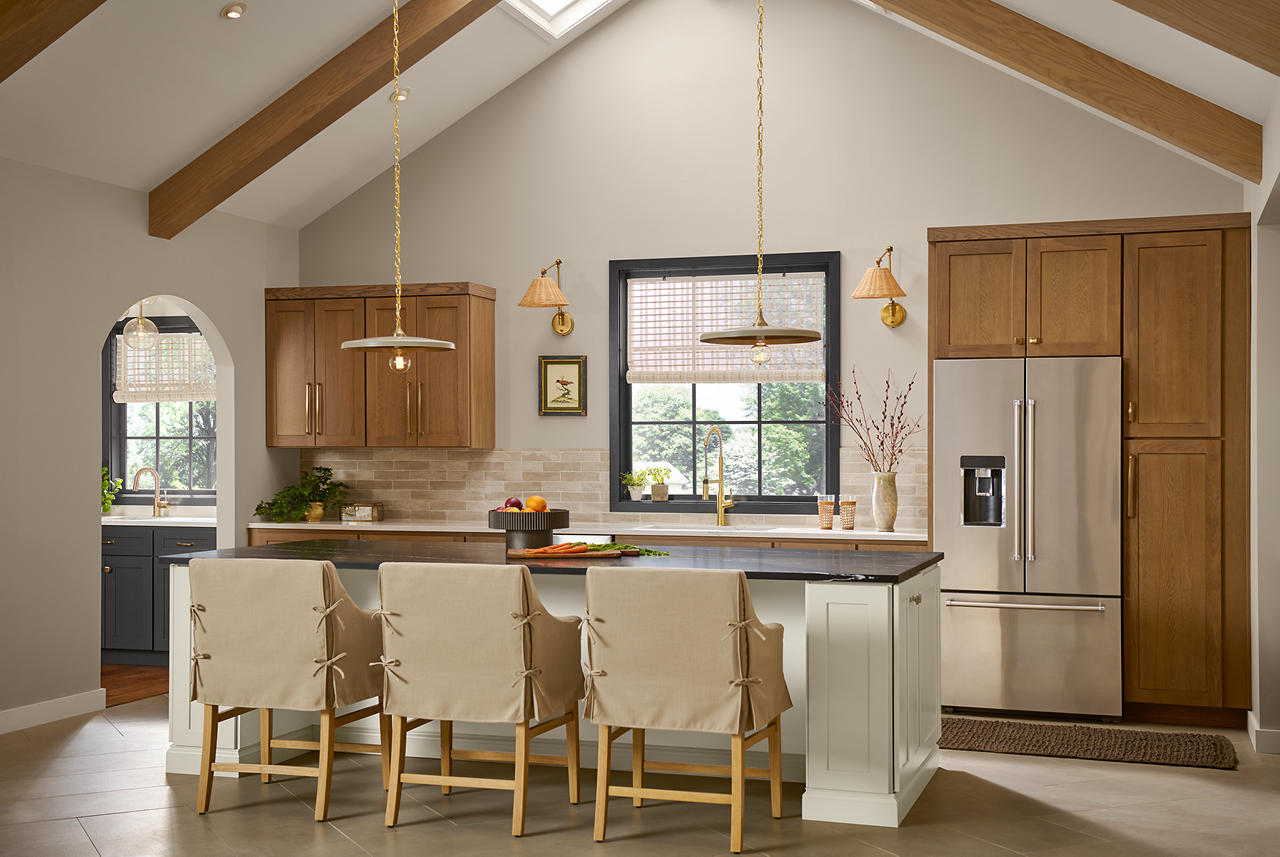
Browns: Cozy, Organic and Sophisticated Caramel, cocoa and espresso-inspired tones can make a kitchen feel grounded and elegant. Lighter shades pair beautifully with white and cream for a soft natural palette, while deeper tones work well with stone, black accents and warm metals for a more dramatic look.
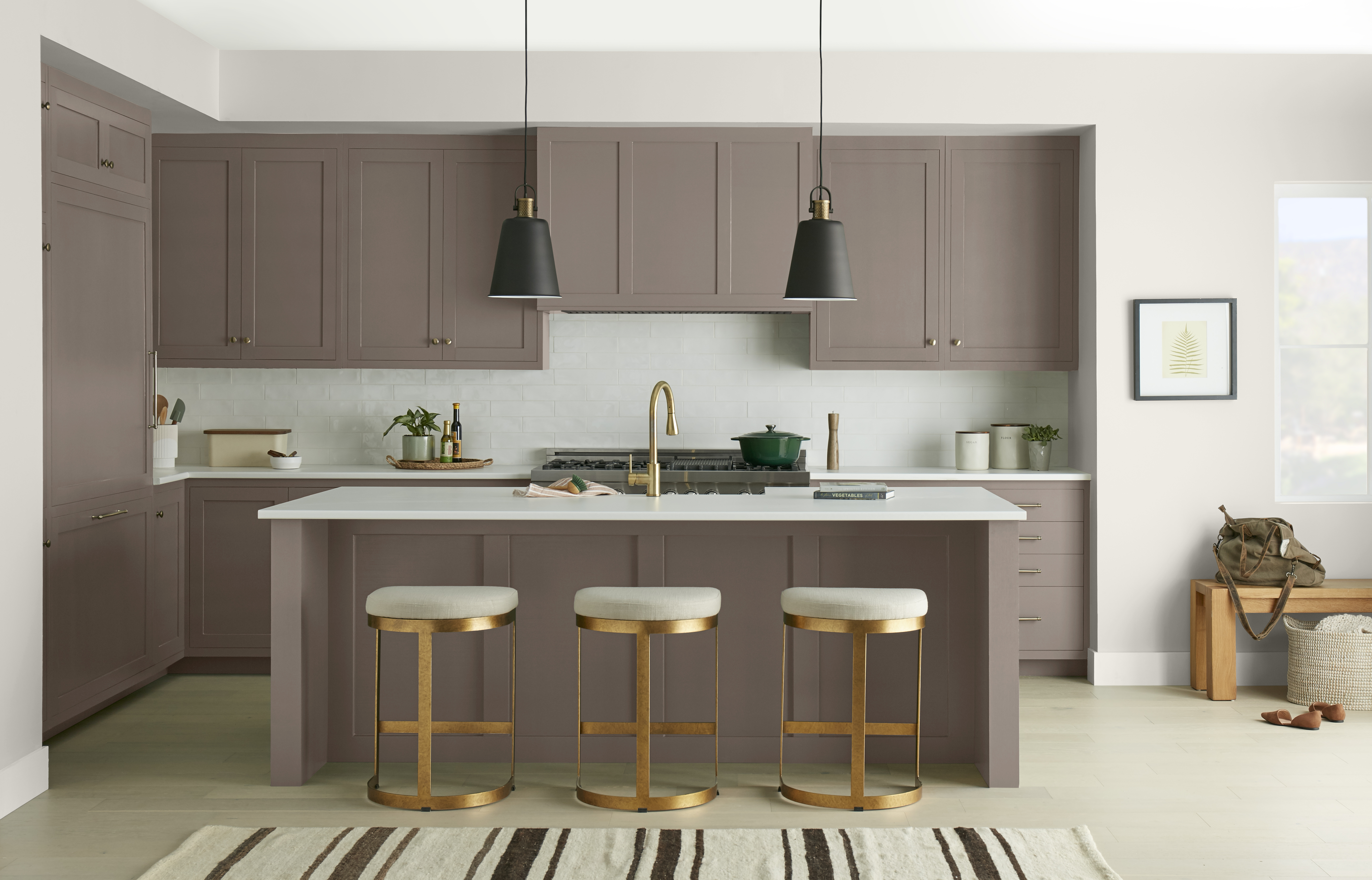
Greys: Balanced, Modern and Refined Warm greys feel soft and approachable, while deeper charcoal tones can add modern contrast. These versatile shades work beautifully on cabinetry, islands and walls, offering a polished foundation for wood, tile and metal finishes.
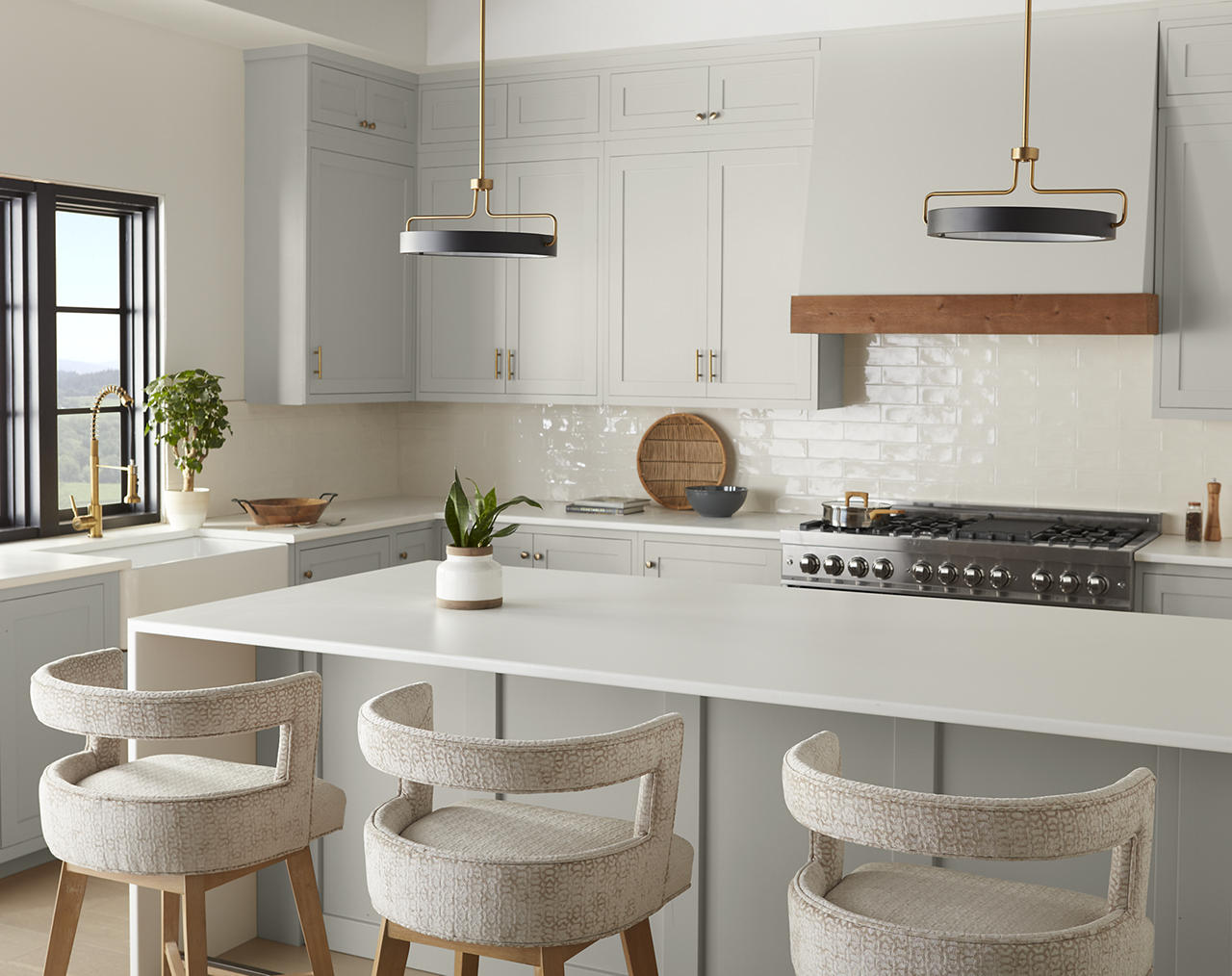
The best kitchen colour is the one that supports how you want the space to feel. Whites and neutrals offer timeless flexibility, while bold hues can create personality and visual interest. Soft colours can make a kitchen feel calm and inviting, while deeper shades can add drama, richness and contrast.
Whether you choose a barely-there white, a warm neutral, a soothing green or a bold cabinet colour, BEHR® paint can help transform the kitchen into a space that feels beautiful, personal and ready for everyday life. To complete your kitchen colour palette, explore paint options for kitchen cabinetry and trim on Behr.ca and consider which sheen is best for your space.
Colourfully yours,
Diana
Use whites and neutrals for timeless flexibility, soft hues for calm and inviting rooms, deeper shades for drama and contrast, and brighter colour families when the goal is personality and visual interest.
References: Kitchen Inspiration | ColourSmart by BEHR
Kitchen cabinets can support many colour families: whites for a crisp classic look, blues and greens for calm or nature-inspired palettes, neutrals and greys for versatility, and reds, pinks, purples or deeper hues for stronger focal points.
References: Kitchen Inspiration | ColourSmart by BEHR
Use a more durable, cleanable sheen where the space sees traffic, moisture or frequent touch. Satin enamel is a practical option for kitchens and baths, while semi-gloss enamel is a strong fit for cabinets and trim.
References: Interior Sheen Guide | Cabinet, Door & Trim Enamel
Use bold shades in focused placements such as an island, lower cabinets, pantry door, breakfast nook, open shelving backdrop or accent wall, then balance them with warm whites, neutrals, natural wood, stone, tile or metal finishes.
References: Kitchen Inspiration | ColourSmart by BEHR
Consider cabinet condition, finish expectations and time commitment before starting. If previously painted cabinets have a glossy finish, scuff-sand or degloss the surface to support adhesion before painting.
References: How to Paint Kitchen Cabinets
Use colour on cabinets, islands, lower cabinets, upper cabinets, pantry doors, trim, ceilings, breakfast nooks, open shelving backdrops and accent cabinetry to control how subtle or dramatic the palette feels.
References: Kitchen Inspiration | ColourSmart by BEHR