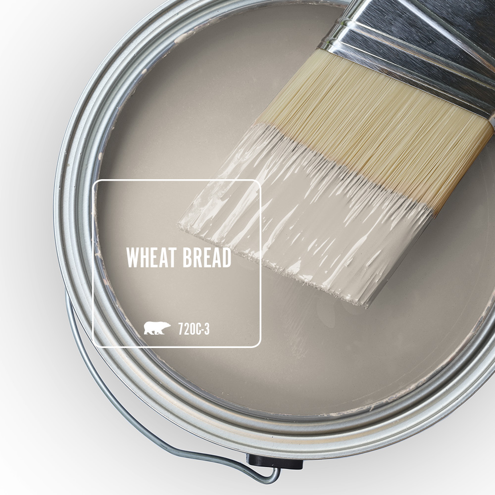
There’s something undeniably comforting about a space that feels warm, welcoming and lived in. Wheat Bread 720C-3 captures that feeling with ease. Inspired by the simple beauty of natural materials and sun-kissed landscapes, this rustic neutral brings a sense of familiarity and comfort to any room. Its soft, earthy character creates a cozy backdrop that feels both timeless and inviting and effortlessly homey.
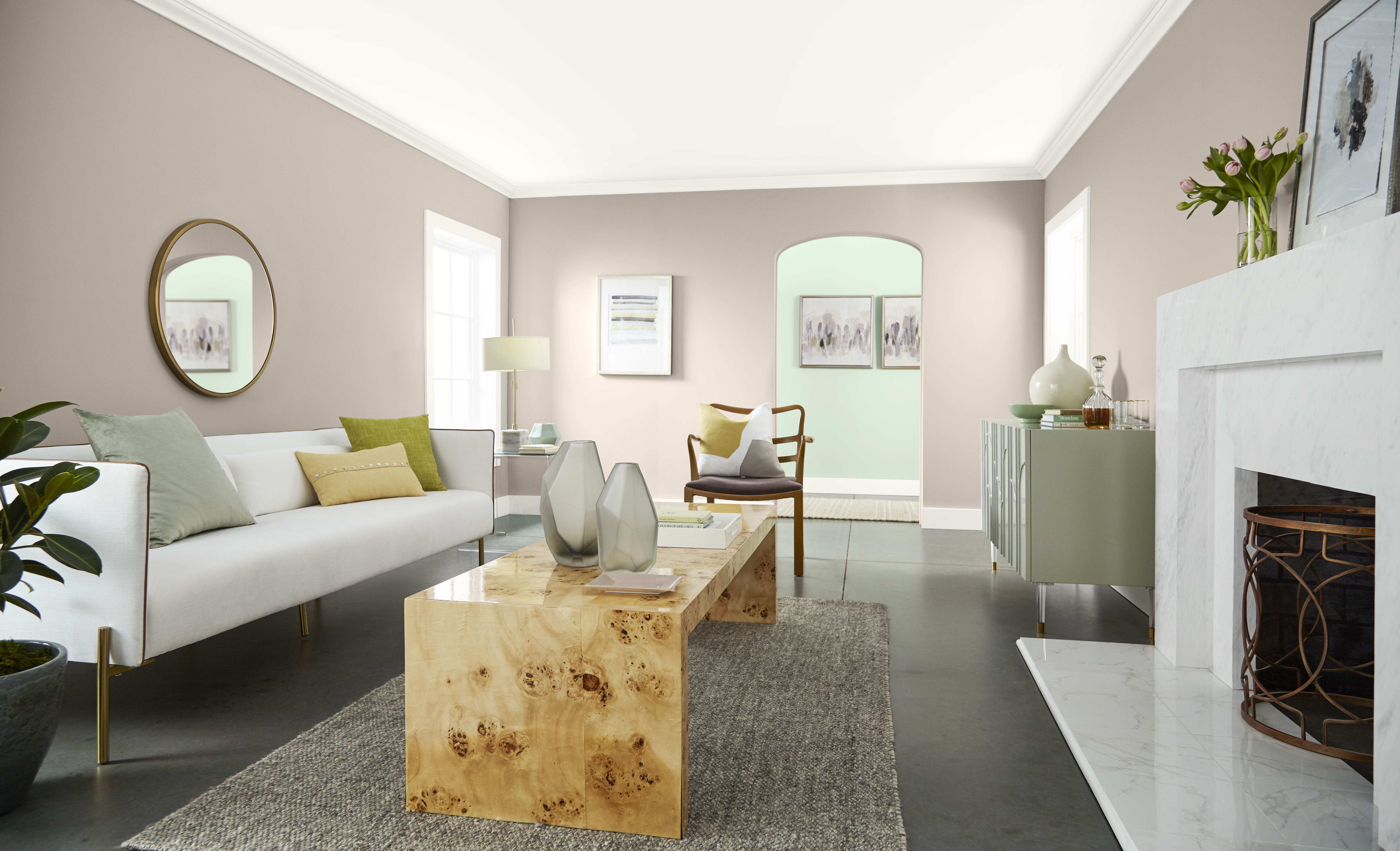
Wheat Bread offers the kind of versatile warmth that helps a house feel like home. In a bright and spacious living room, it creates a soft, warm neutral backdrop that makes the space feel calm, comfortable and welcoming. This warm neutral paint colour adds subtle depth to the walls while allowing the white fireplace, light upholstery, natural wood coffee table and greenery to stand out with fresh contrast.
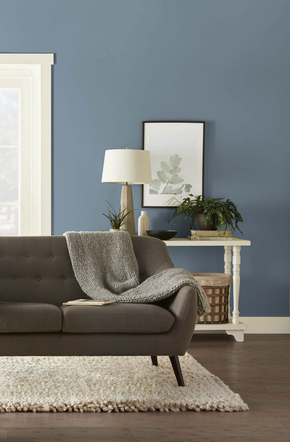
As a versatile taupe-grey paint colour for living rooms, Wheat Bread blends timeless warmth with modern ease. Its balanced warm tone helps soften clean architectural details and brings a homey feel to the room, making it an inviting place to gather, relax and unwind. For anyone looking for neutral paint colours for living room spaces, Wheat Bread offers a grounded yet elevated option. Pair it with a light pastel green for a fresh, airy look.
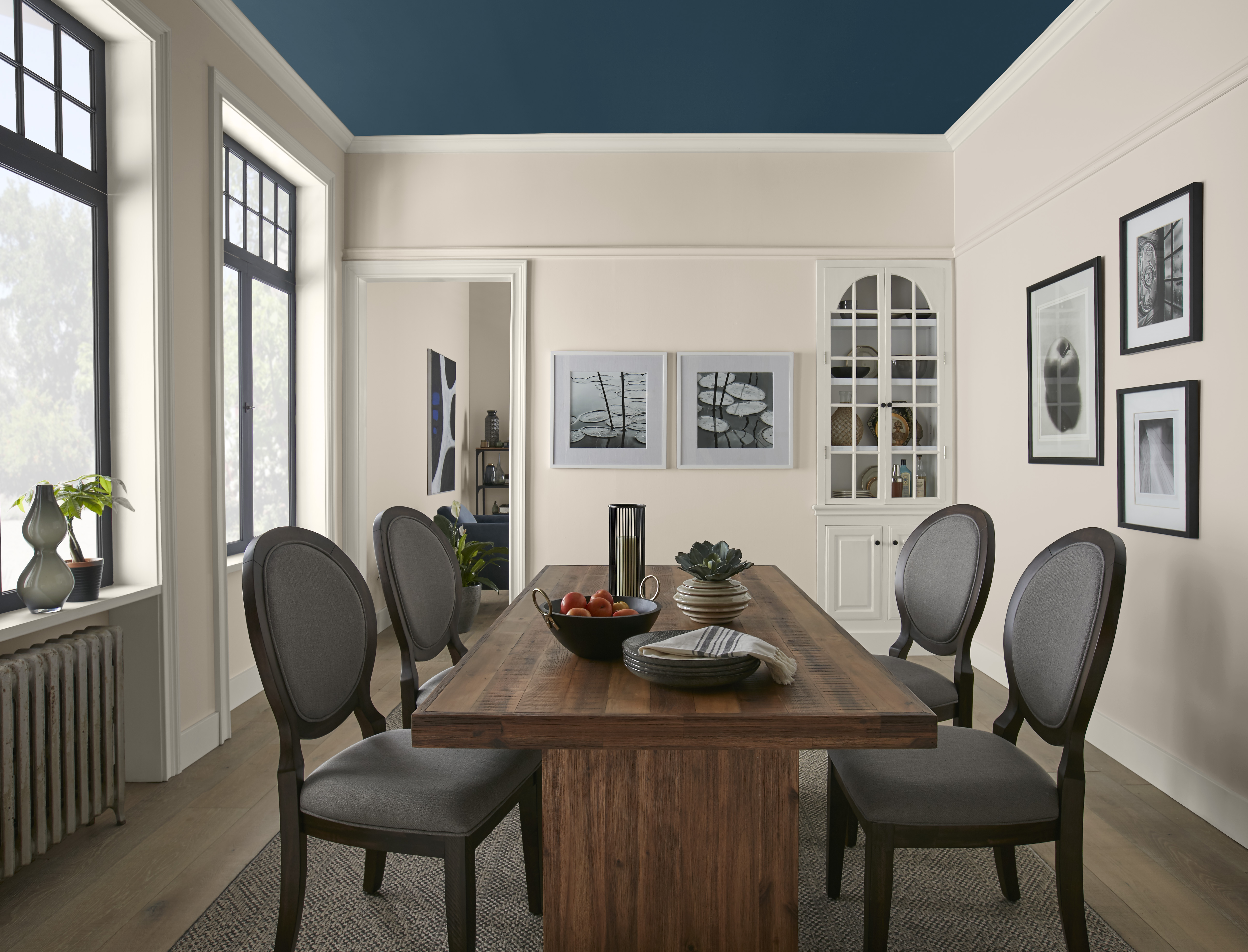
Create intentional contrast and a memorable dining space with a palette that feels both sophisticated and inviting with Wheat Bread on the walls. This neutral hue brings a sense of warmth, comfort and approachability, while the deep, saturated blue ceiling adds depth, drama and visual interest. The crisp white trim highlights the room’s architectural details, creating a clean frame that balances the richness overhead and helps the darker ceiling feel intentional for an atmosphere that encourages lingering conversations and shared meals.
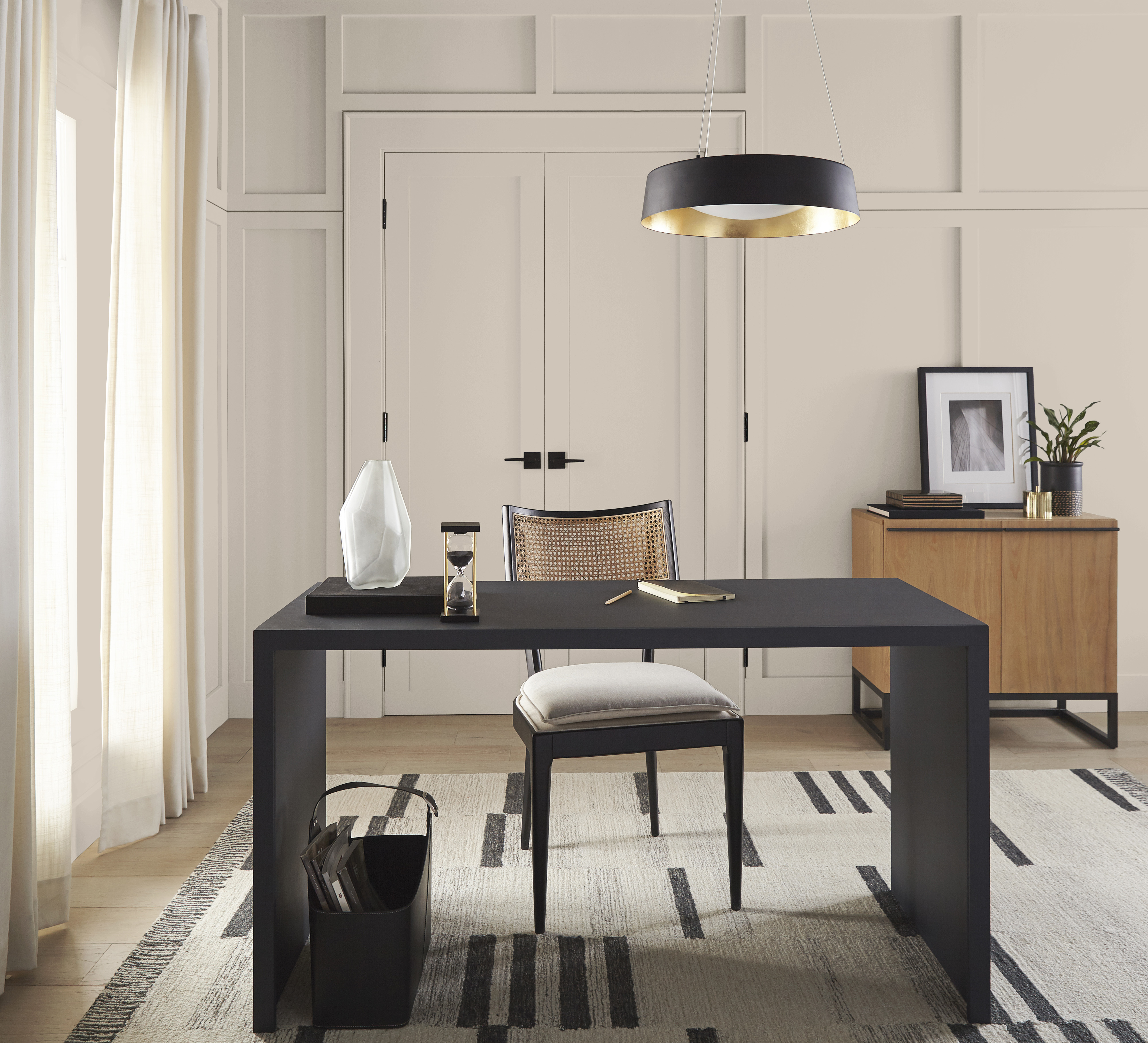
Colour drenching a home office in Wheat Bread creates a workspace that feels calm, cohesive and effortlessly refined. By enveloping the walls, trim and millwork in a single warm neutral, the room takes on a seamless quality that minimizes visual distractions and allows the architectural details to shine. For those exploring home office paint colours, Wheat Bread offers subtle warmth that supports focus, creativity and comfort.
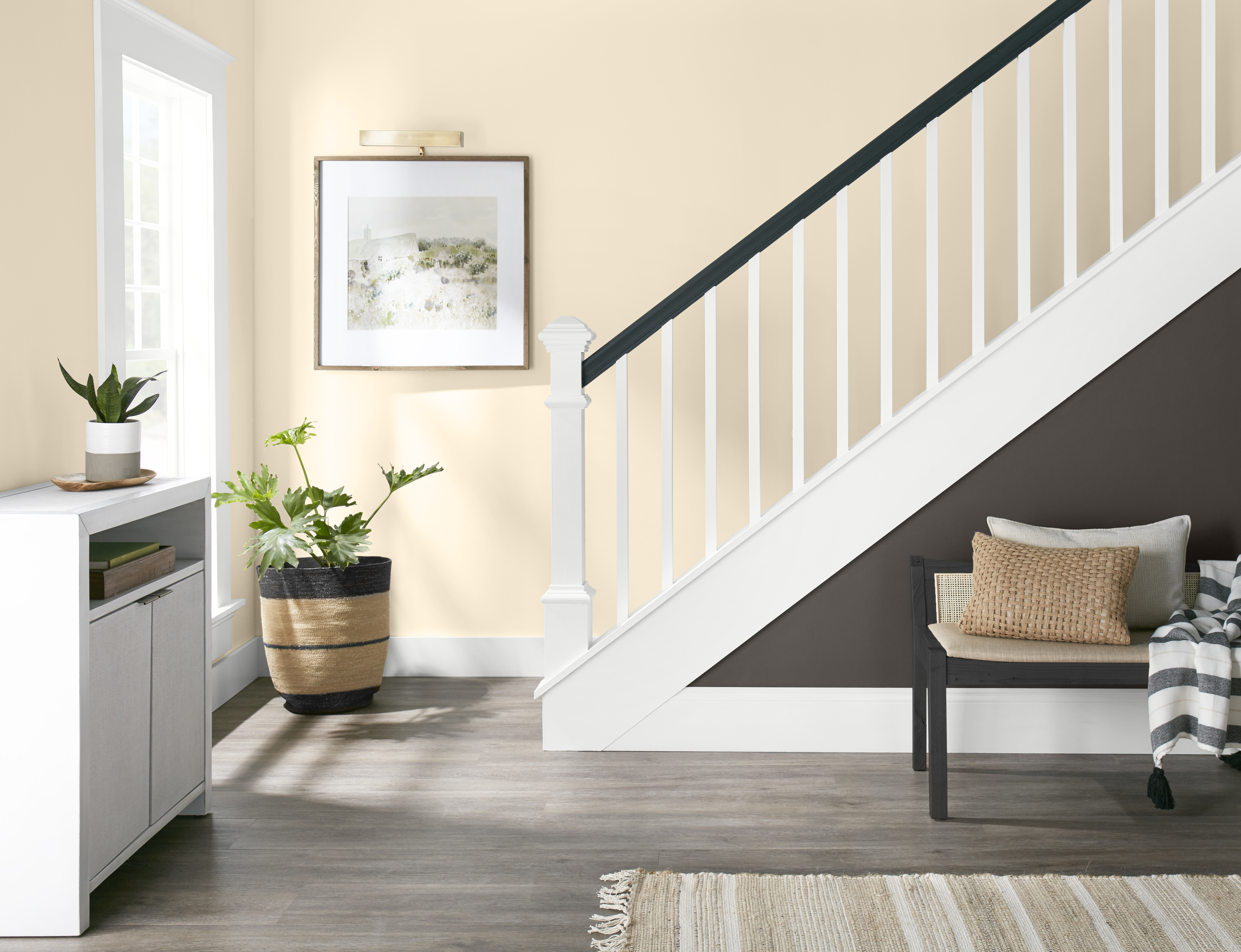
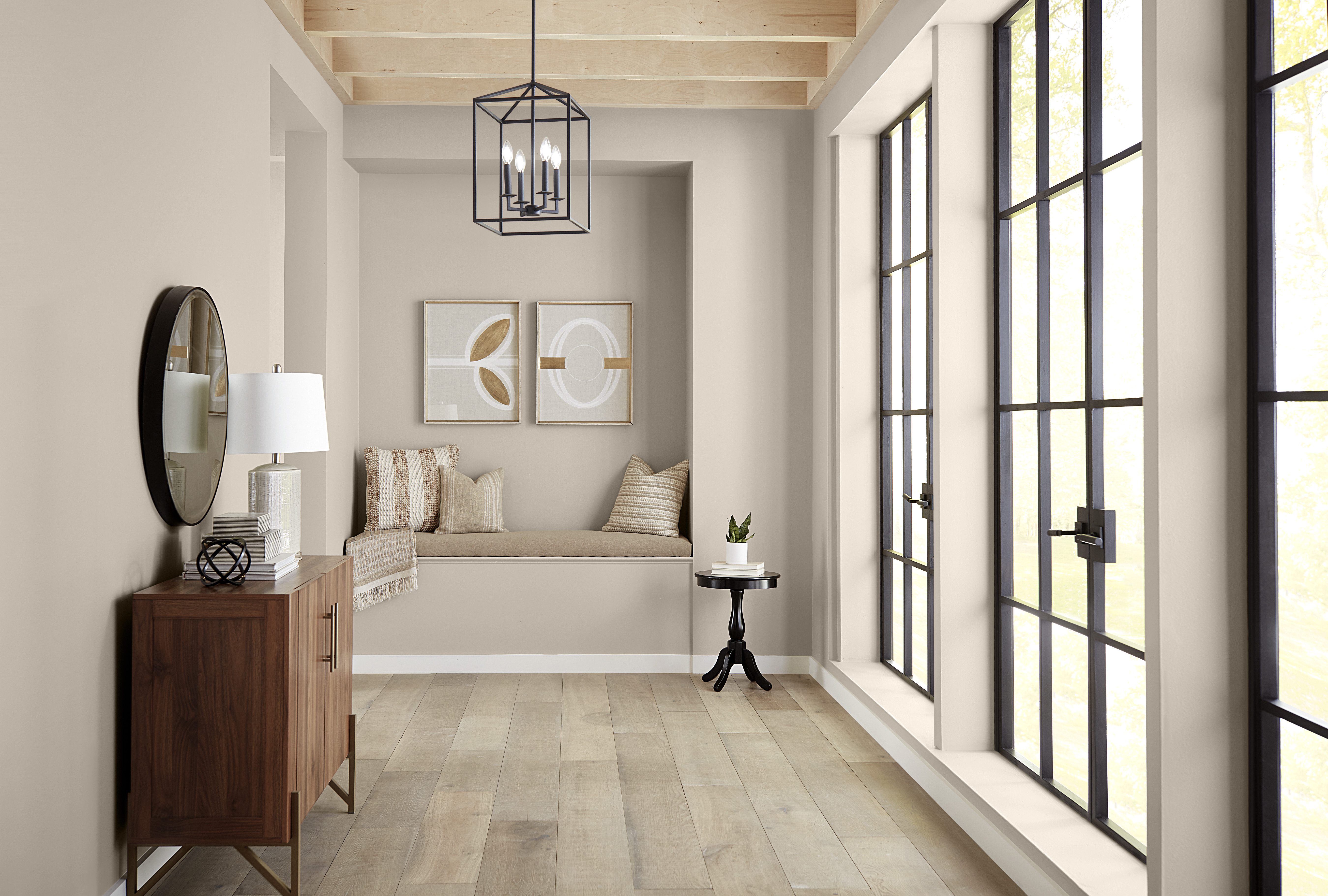
Hallways are often overlooked, but the right paint colour can transform them into spaces that feel intentional and inviting. When considering hallway paint colours, Wheat Bread brings a soft, welcoming warmth that elevates this transitional area beyond a simple passageway. Its subtle taupe-grey undertones add depth and character while maintaining an airy, light-filled feel.
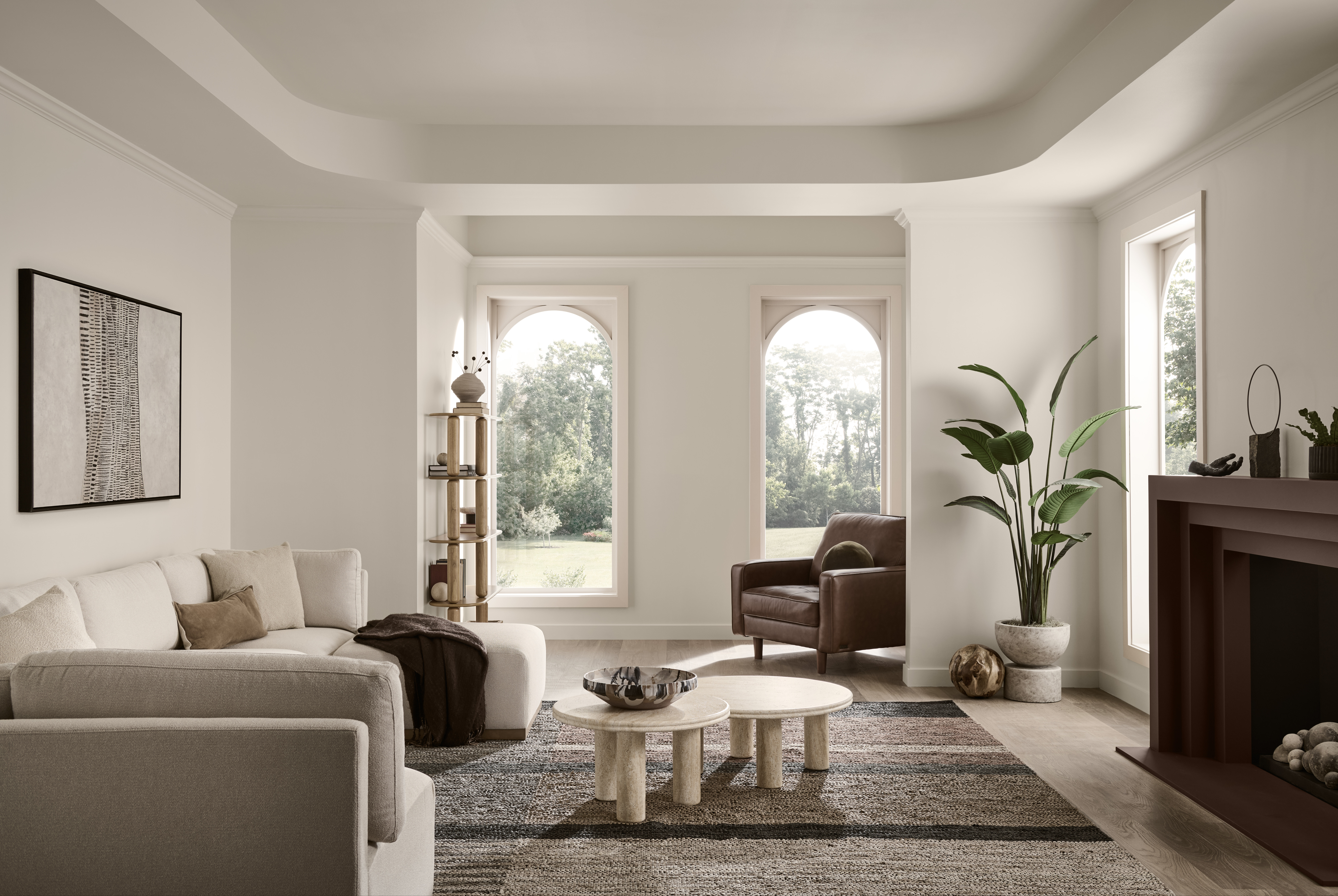
Wheat Bread proves that neutral paint colours can make a lasting impression. In this living room, the warm taupe-grey hue creates a soft, inviting backdrop that enhances the room’s natural light and highlights its architectural details. Its understated warmth brings a sense of comfort and balance to the space, allowing layered textures, natural materials and thoughtfully curated furnishings to take centre stage. The versatile neutral effortlessly ties together the room’s design elements, creating a timeless retreat for everyday living and effortless entertaining.
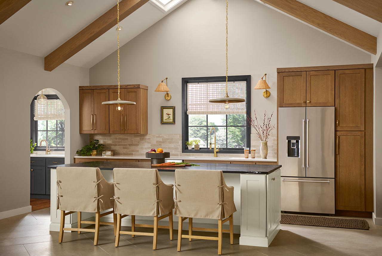
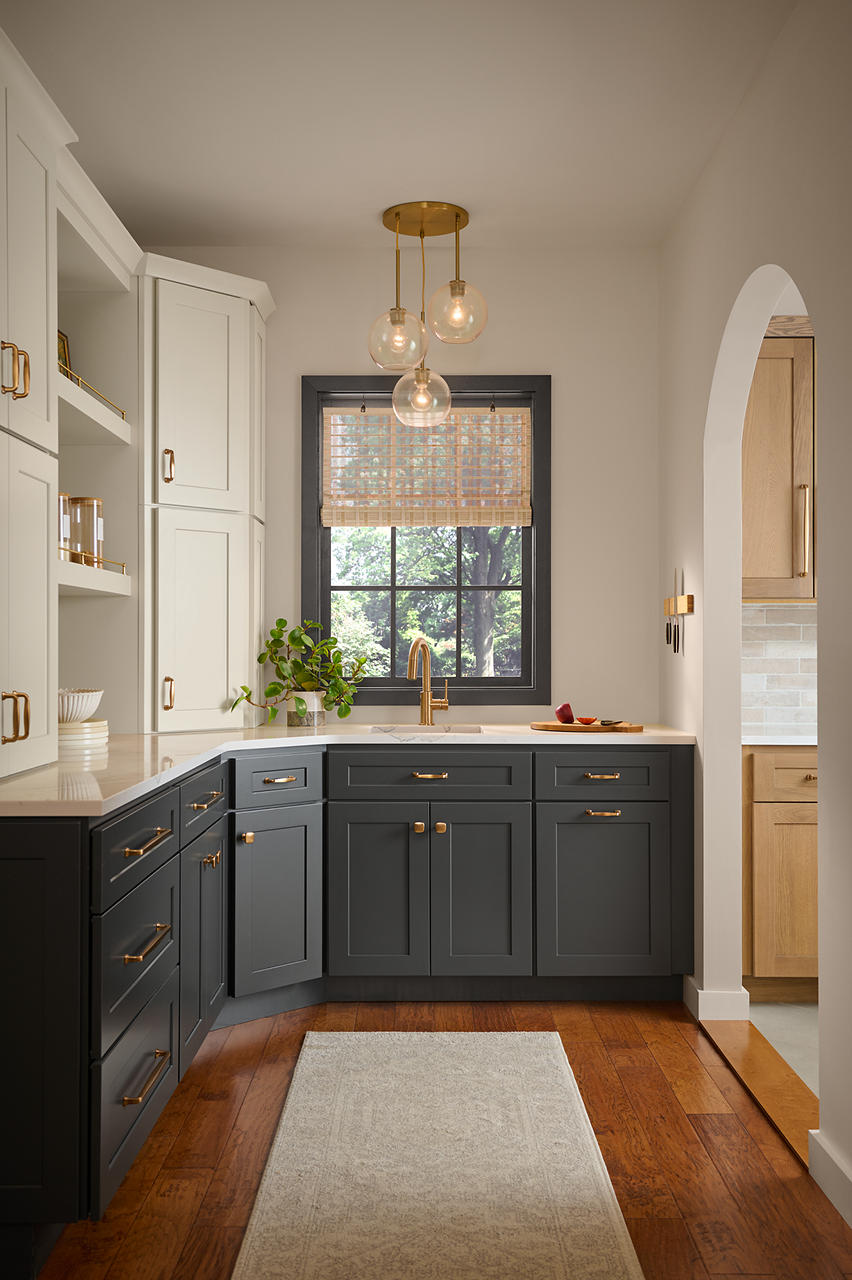
A walk-in pantry deserves the same thoughtful attention as the rest of the home, and Wheat Bread helps elevate this hardworking space with warmth and style. The soft taupe-grey hue creates an inviting backdrop that brightens the room while adding subtle depth and character. Its understated warmth helps transform a purely functional area into a space that feels organized, welcoming and intentionally curated. This versatile neutral also creates a seamless transition between adjoining rooms, making the home feel more cohesive from one space to the next.
From welcoming living rooms and elegant dining spaces to hardworking pantries, home offices and hallways, Wheat Bread proves that a warm neutral can have a transformative impact throughout the home. Its soft taupe-grey undertones create a sense of comfort and balance, while its versatility allows it to pair effortlessly with a wide range of colours, materials and architectural styles. Whether used as a backdrop for everyday living or as part of a thoughtfully layered palette, Wheat Bread brings warmth, character and timeless appeal to every space it touches.
Ready to bring the comforting beauty of Wheat Bread into your home? Explore this versatile neutral on behr.ca, order a paint sample and discover how its inviting warmth can help create spaces that feel welcoming and connected.
Colourfully yours,
Diana
A: Wheat Bread 720C-3 is a Behr paint colour with a warm, rustic neutral feel. Use it when the goal is a comfortable, homey interior backdrop that can support natural textures, soft whites, dark accents and layered neutral décor.
References: Wheat Bread Colour Detail | Behr Paint Colours
A: Yes. Wheat Bread works as a warm neutral because it brings softness and earthiness without feeling stark. It is well suited for spaces where the design goal is warmth, comfort and an approachable neutral backdrop.
References: Wheat Bread Colour Detail | Behr Paint Colours
A: Wheat Bread can support a range of interior rooms, including living rooms, dining rooms, home offices, hallways and pantries. It works especially well where warm neutrals, natural wood, white trim or dark accent colours are part of the palette.
References: Wheat Bread Colour Detail | Behr Paint Colours
A: For a warm neutral palette, pair Wheat Bread with clean whites, deep charcoal or black accents, wood tones and saturated blues. Surface mapping is important: identify which colours are used on walls, trim, cabinets, ceilings, baseboards and accent details.
References: Wheat Bread Colour Detail | Behr Paint Colours
A: Yes. Wheat Bread can be used in a colour-drenched room by repeating the same warm neutral on walls, trim and millwork. This approach can make a workspace feel cohesive and reduce visual contrast while still allowing texture and furnishings to add depth.
References: Wheat Bread Colour Detail | Compare Interior Paint Sheens
A: Choose sheen by surface and room use. Lower-sheen finishes are common for walls and ceilings when a softer look is desired, while satin or semi-gloss finishes can be appropriate for higher-traffic or moisture-prone areas, cabinets and trim.
References: Interior Sheen Guide | Compare Interior Paint Sheens | Behr Interior Paint