Choosing the perfect paint colour for a room can feel overwhelming, especially when aiming for a harmonious palette for an entire room. But don’t worry! The 60-30-10 rule is here to simplify the process.
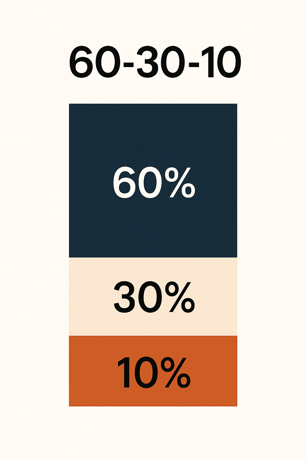
The 60-30-10 paint method is a colour scheme guideline. It is a simple and popular rule used in interior design.
60% is the dominant colour of a room which usually goes on the walls, large furniture, or flooring. It’s the backdrop of the space.
30% is the secondary colour which supports the dominant colour and adds more depth. It may be used on curtains, chairs, rugs or décor.
10% is the pop of colour that gives the space more character. This can be used as an accent wall, accent piece, lamps, artwork, throw pillows and area rug.
The goal of the 60-30-10 method is to achieve a cohesive, well-designed space that feels balanced and harmonious. Discover our top colour palettes, expertly crafted using the 60-30-10 rule, to transform your space into a stunning masterpiece every time!
Here are some tried and true colour palettes below to easily navigate using the 60-30-10 method.
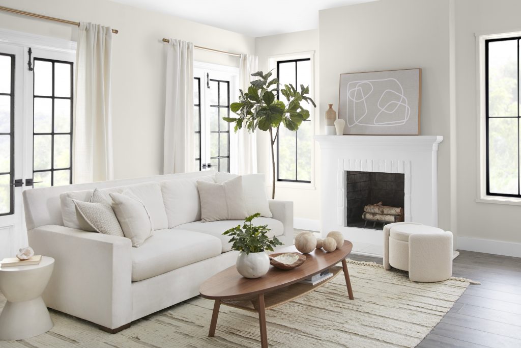
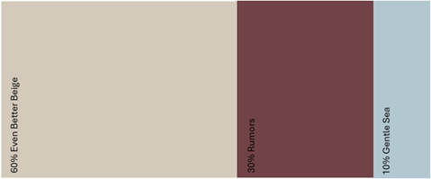
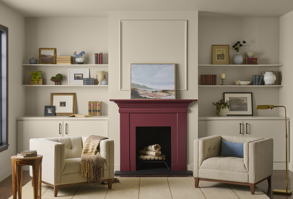
For our first palette, Even Better Beige sets the tone as the dominant colour, covering 60% of the space. The secondary 30% is Rumors, a bold ruby red that adds colour to the fireplace. Finally, 10% is filled with soft blue décor, frames, books and furnishings adding depth and interest.
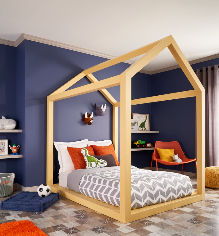
For our next palette, we used Very Navy covering 60% of the walls, creating a dramatic and stylish foundation. Layer in 30% through playful patterns, furnishings, and flooring to add texture. Finish it off with vibrant pops of yellow and orange as the 10% accent bringing energy and warmth to the space.

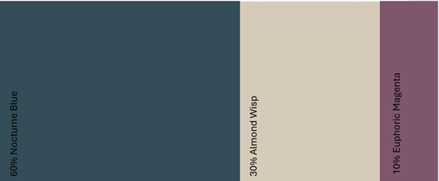
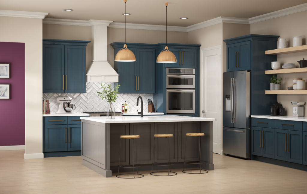
The 60-30-10 method can also be used in kitchens. Nocturne Blue is a deep navy that makes a bold statement on the cabinets, covering 60% of the space. Almond Wisp, a soft beige neutral, balances it out as the 30% wall colour. Finally, a 10% Euphoric Magenta accent adds that finishing touch, tying the entire area together with style and harmony.
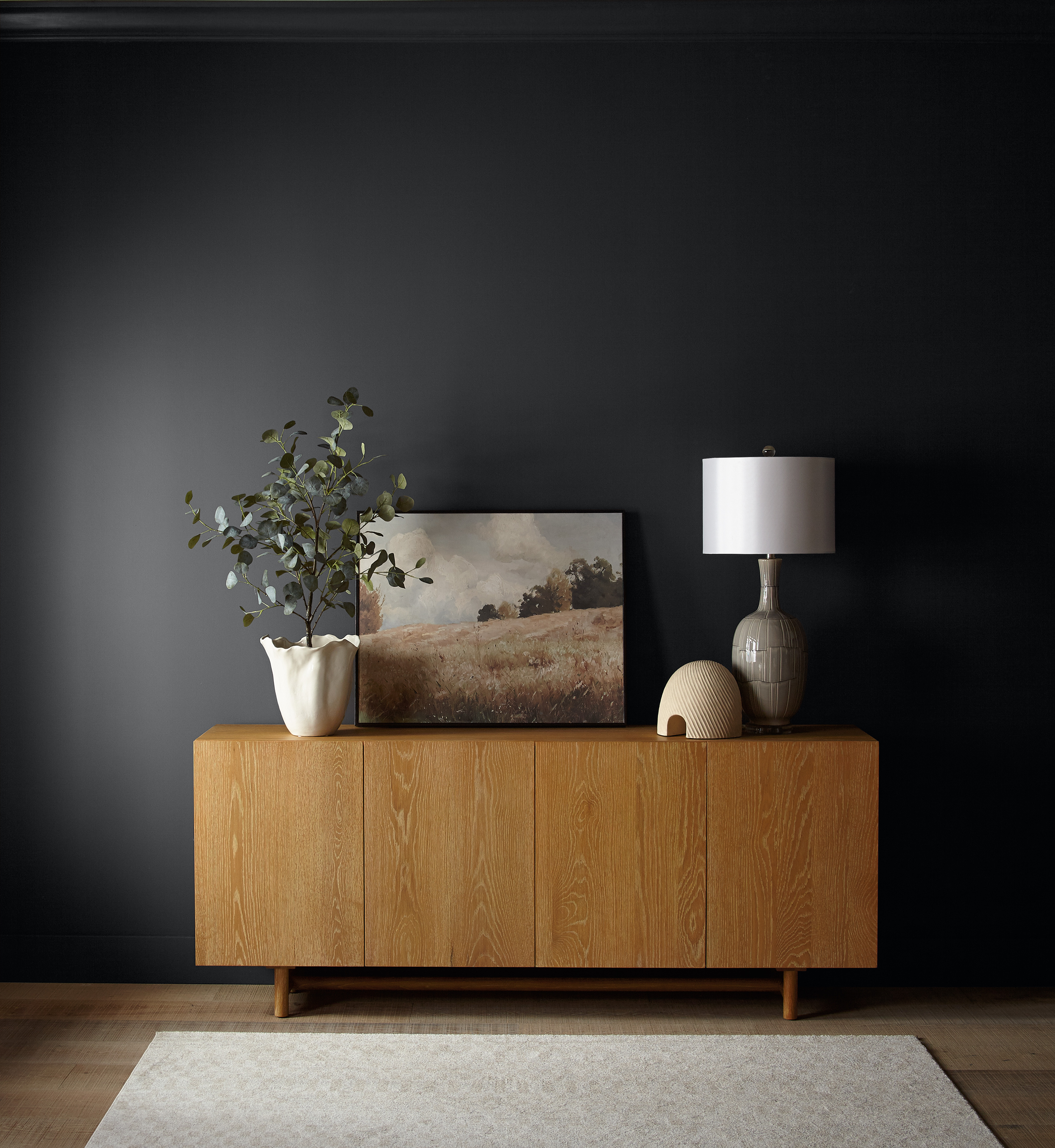
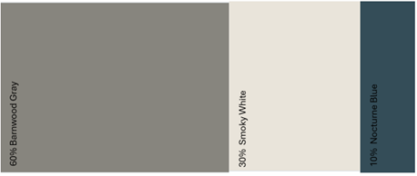
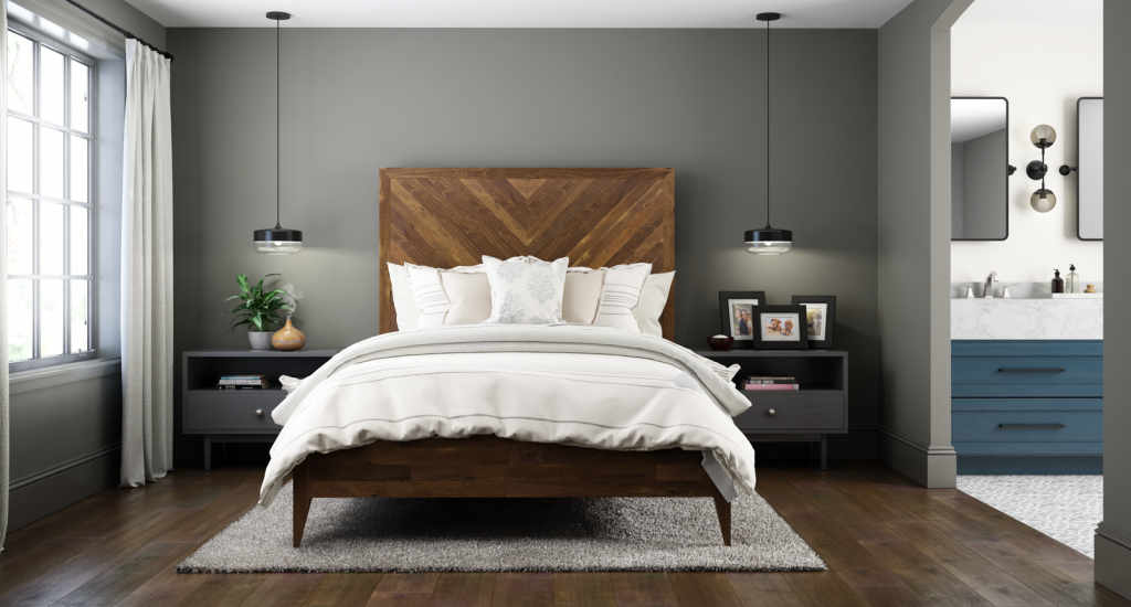
Barnwood Gray, with its wood inspired tone and hint of green makes a bold statement covering 60% of the room. In the bathroom area, Smoky White adds balance and brightness, contributing 30% to the overall colour palette. The remaining 10% comes through the warm wood furnishings and subtle pops of colour.
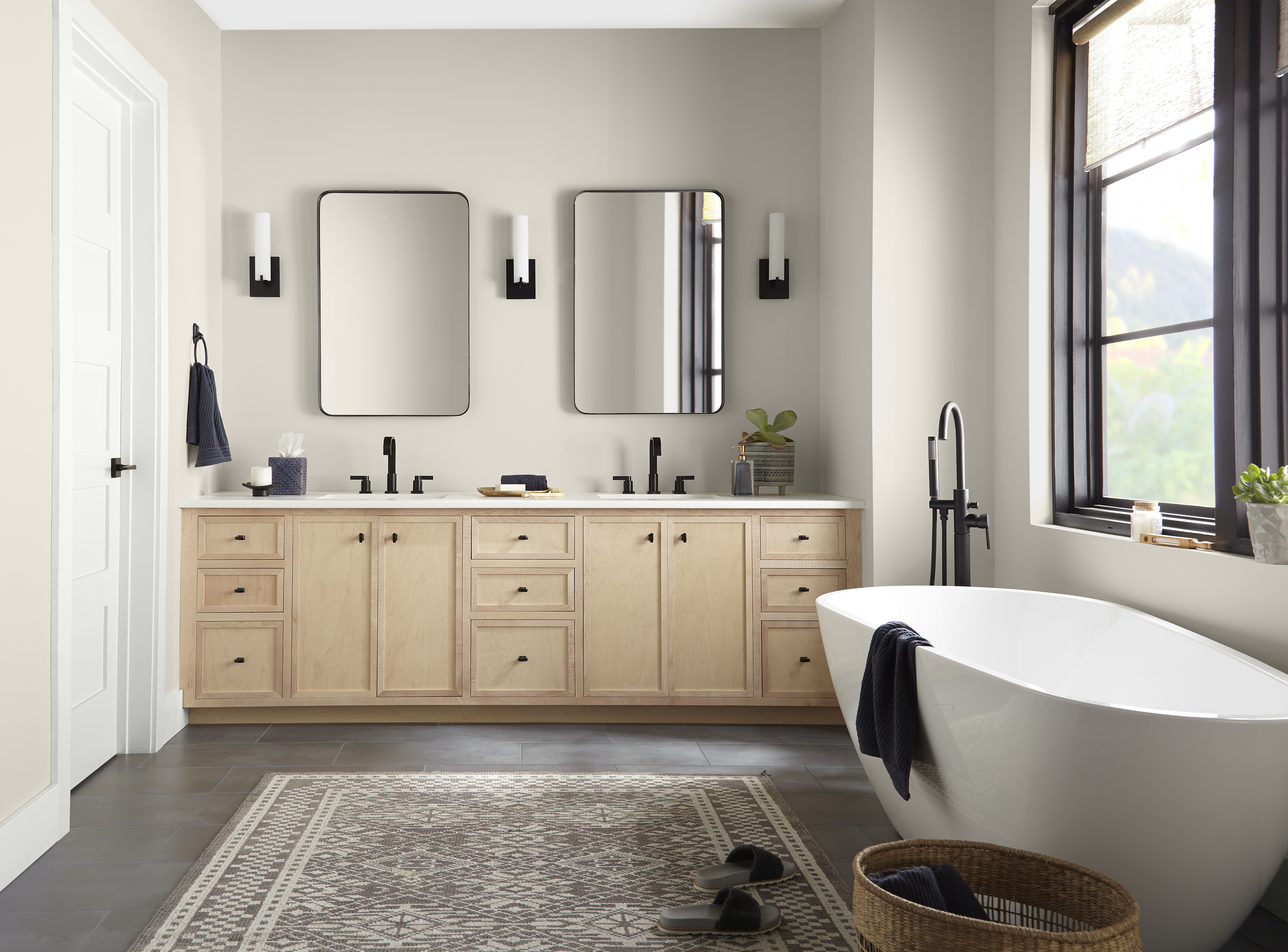
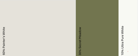
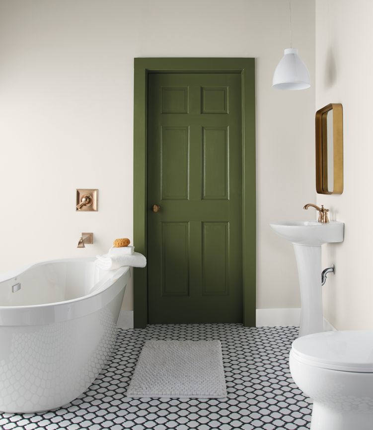
The 60-30-10 method works beautifully in a bathroom too. In this space Painter’s White covers 60% of the walls, creating a clean and airy backdrop. 30% comes through accent elements like the door in Secret Meadow,, gold fixtures and crisp white furnishings. The final 10% is brought in through the bathroom trim.
All in all, using the 60-30-10 method is a reliable way to build a balanced colour palette for any living space. It simplifies decsion making and ensures your room feels cohesive, stylish and thoughfully designed every time.
Colourfully Yours,
Deanna